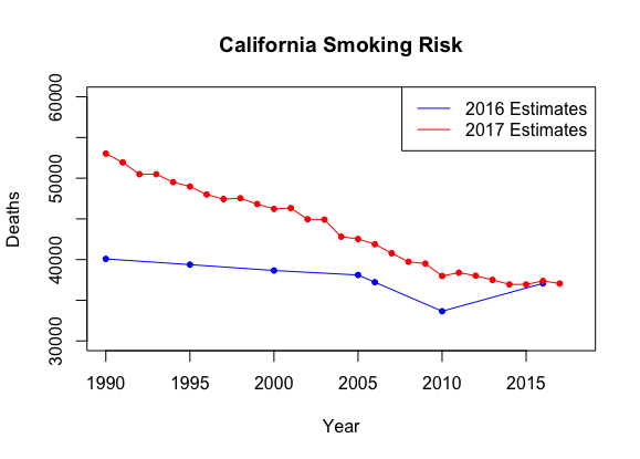
Smoking Discrepancy
Through an internship with the California Department of Public Health, I have recently been contributing to the California Community Burden of Disease Engine, a data visualization tool built with R Shiny that provides a lens into the relation of place and health disparities. My primary role has been extracting, analyzing, and visualizing health data created and made accessible by IHME (The Institute for Health Metrics Evaluation).
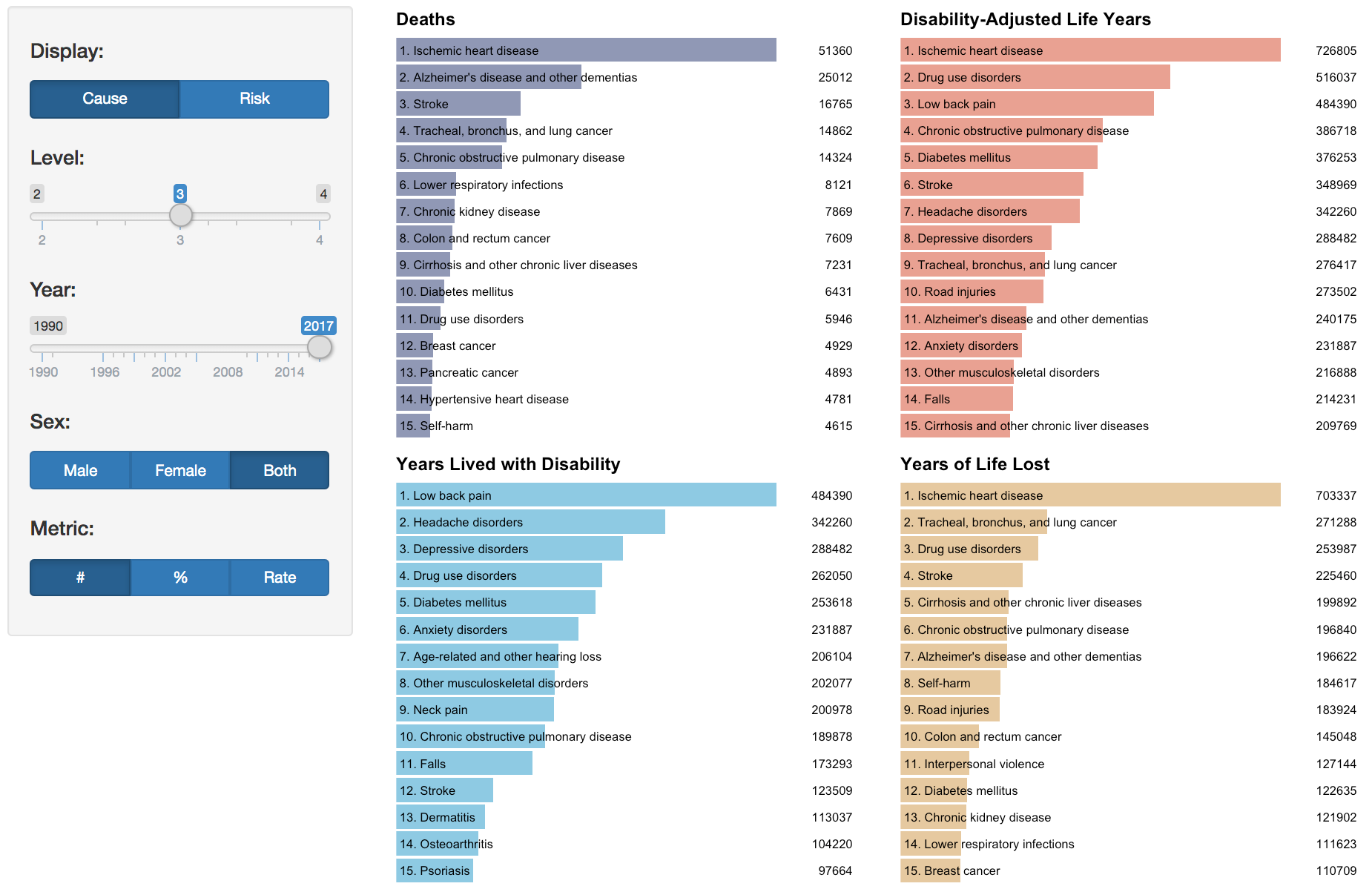
The first chart I created is a series of simple bar charts that show the top causes or risks for four common measures:
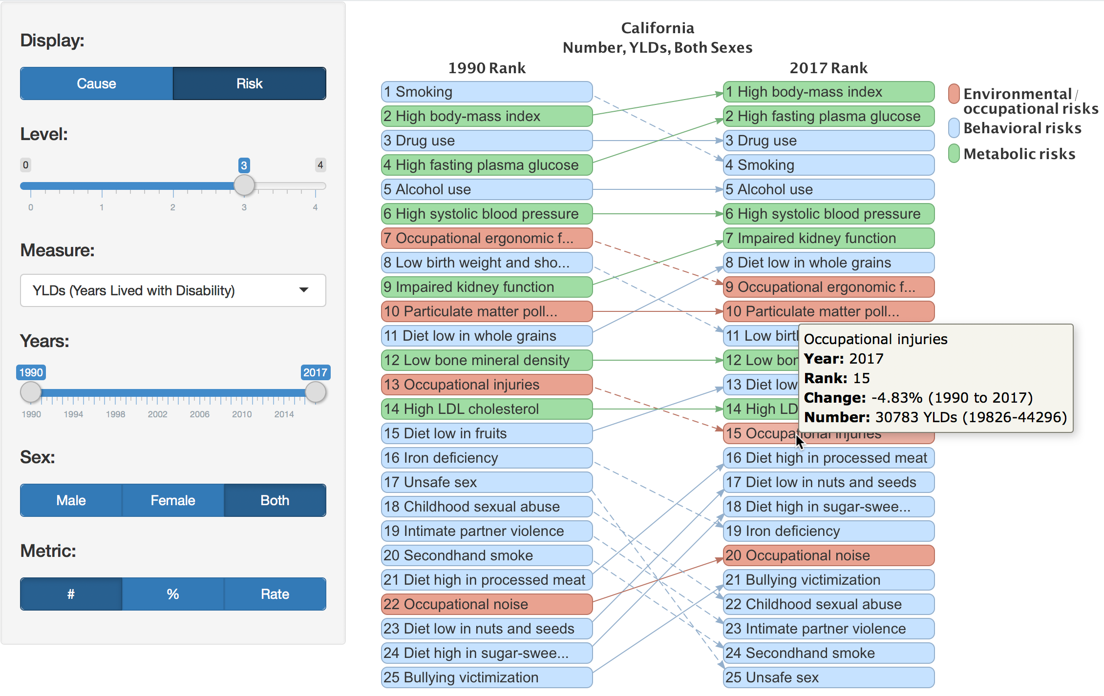
The first visualization I created with IHME data is a diagram that shows the change in rankings between two years of causes or risks:
When I first started using IHME’s API, I was using IHME’s GBD 2016 HealthData API version